How writing contests became Pocket FM's most powerful growth engine
I owned the design across the full contest ecosystem, from how writers find contests to what happens after they submit.
Most writers never got the chance contests were meant to give them.
Writing contests are how Pocket FM finds its next blockbuster series. Between 10 and 20 run simultaneously across genres, languages, and geographies worldwide. Writers who join contests convert at 2×. Pocket FM has ~17M+ annual active listeners, and 65% of writers on the platform started as listeners. Listeners who join a contest activate as writers at more than double the rate.
Contests could turn writers into the creators of blockbuster series. But for most writers, that never happened. Some never knew a contest was running. Others saw one but didn't understand what to write. A few joined, finished, but heard nothing back. Pocket FM rejected submissions for theme mismatch, and writers had no idea why. The system broke at every step a writer took.
I rebuilt the contest journey end to end, from discovery and enrollment to the post-submission experience. Improved how writers discovered contests, participated in them, and received recognition after submission. I've covered each stage of the journey in detail. Let's dive in.
Results after rebuilding the contest ecosystem.
Contest enrollment after the rebuild
Contest adoption after adding the contest screen to series creation
Participation after discovery redesign, existing writers
Participation after discovery redesign, new writers
Winners who shared their certificate
Pocket FM ran writing contests with real cash prizes, but writers didn't know they existed.
.png)
.webp)
.png)
Contest card on the Studio home page
The primary touchpoint for exploring contests
What the data showed
83% of contest-eligible writers who created a series had never seen the contest detail page. They were writing actively but had no idea a contest was live.
The homepage carousel showed contest cards one at a time with a slight peek of the next. Data from both the consumer and writer apps showed users rarely scroll horizontally, and interaction tracking confirmed it: writers engaged with the first 2–3 cards, and the rest, across 10–15 live contests, went effectively invisible.
What research revealed about the discovery gap.
Findings from India and US
- Writers said contests weren't available in their genre, even though contests in that genre existed.
- Writers mentioned they didn't know a contest was running while they were writing their series.
- Writers said the contest section on the homepage didn't feel relevant enough to explore further.
- Writers felt that finding the right contest required too much effort, so they gave up early.
- Writers mentioned that the contests they saw first felt repetitive: "the themes seem repetitive," which made them stop exploring further, assuming all contests were the same.
Writers weren't avoiding contests. They couldn't find one that felt relevant to them. It had nothing to do with motivation or confidence. The right contest was buried behind a UI pattern most writers never got past.
The data and conversations with writers revealed two distinct discovery failures.
Problem A
Writers who visited the contest section but couldn't find a relevant contest. The horizontal carousel buried everything beyond the first 2–3 cards. Genre navigation didn't exist. A horror writer had no way to filter for horror contests.
Problem B
Writers who never reached the contest section at all. This covers the 83% who were writing actively but never saw a contest was live.
How I helped writers find a relevant contest


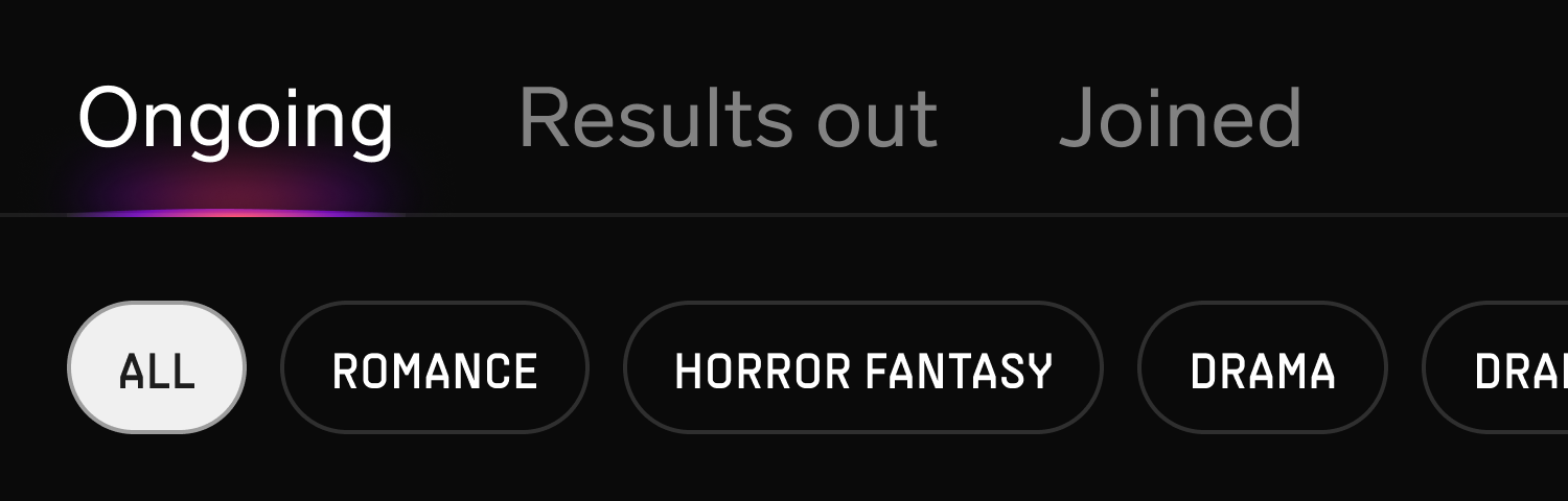
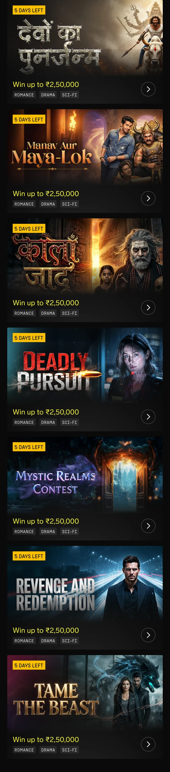

How I reached writers who never saw a contest
Key decisions
110%
Increase in contest adoption
By improving discovery across multiple touchpoints, we reached writers who were previously unaware of contest opportunities.
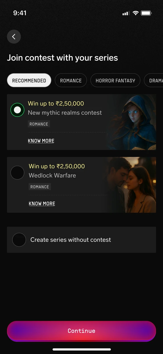
- • 24% → 51% contest adoption after introducing contest recommendations during series creation.
- • 81% of writers who enrolled through this flow had never visited the contest page.
- • Discovery improvements drove +51% participation among existing writers and +20% among new writers.
Improving discovery was only the first step. The contest details
page had to turn interest into participation.



Problem with old contest details page
The contest details page ran as a web view inside the Flutter app. It looked nothing like the rest of the product. Everything on it carried equal weight. Writers couldn't tell if the contest was right for them or whether it was worth the commitment.
The gap
Writing demands real effort. Before entering a contest, writers need three things clear.
The old design had every answer. Writers still walked away unsure.
Key decisions
2×
Contest enrollment doubled
I made the contest details page easier to understand and evaluate. Enrollment increased, and more writers moved into the creation flow.
- • 18% → 38% contest enrollment in an A/B test on the same contest with the same cohort of writers.
- • 85% of writers who tapped "join contest" went on to start a new series.
Improving participation revealed another gap after writers
joined the contest.
After version 1 shipped
I reviewed the post-launch data
Enrollment numbers looked strong, but contest outcomes told a different story.
- Writers joined contests but wrote for the wrong theme or genre.
- Editors rejected their submissions.
- Writers spent weeks writing before getting disqualified.
- Trust in the contest experience declined.
One insight stood out.
4%
Writers who watched the theme explanation video, the only source of theme education
Key decisions
Rethinking information hierarchy
The information hierarchy was rebuilt around the contest theme, ensuring writers understood the requirements before investing weeks into a submission.
- Moved the theme explanation video to the first fold and autoplayed it, ensuring every writer saw the contest theme immediately.
- Kept the video playing while writers explored the page, allowing them to absorb the explanation without interrupting their browsing.
- Reorganized the hero section to prioritize prize pool and key details to make better use of the first fold.
- Made the contest theme and genre requirements explicit, so writers clearly understood what they needed to follow to qualify.
When a contest ended, writers were getting no acknowledgment
for the effort they put in.
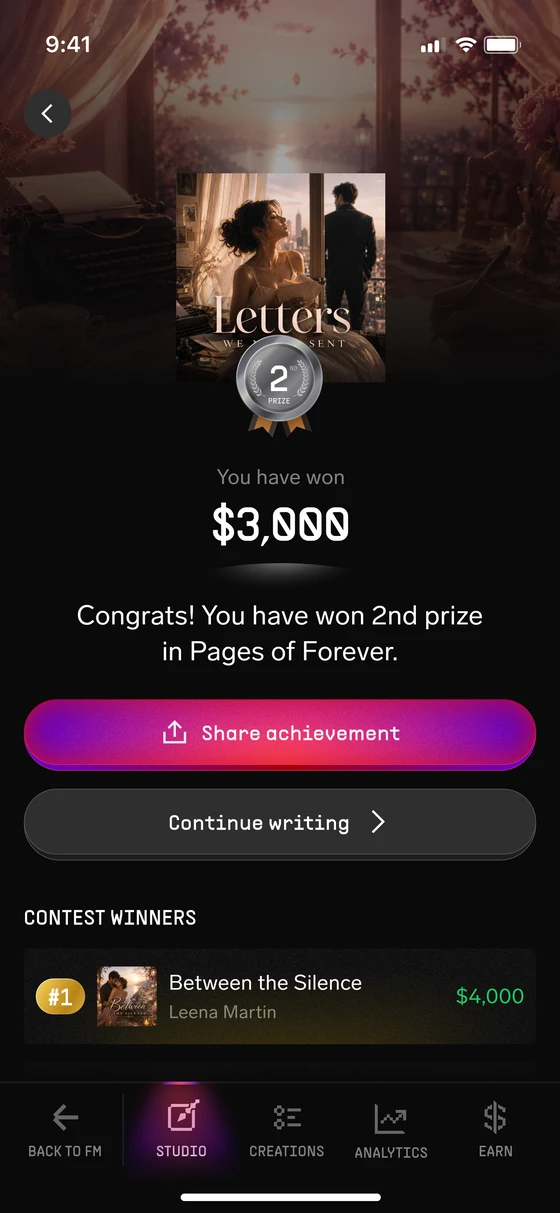
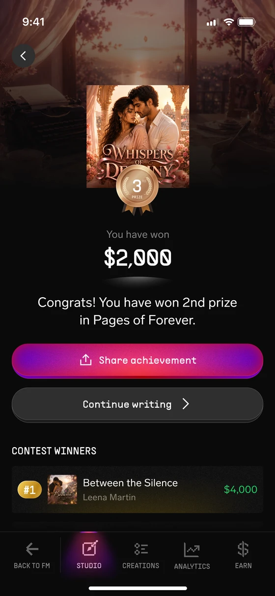
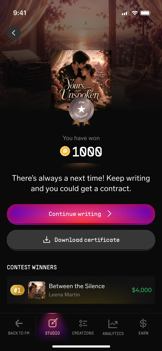
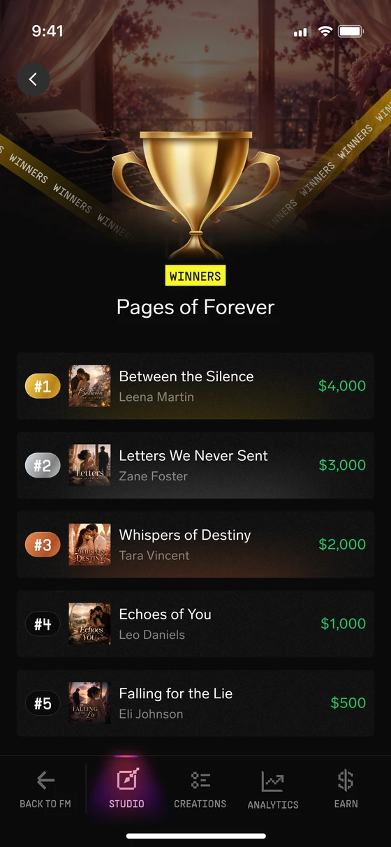
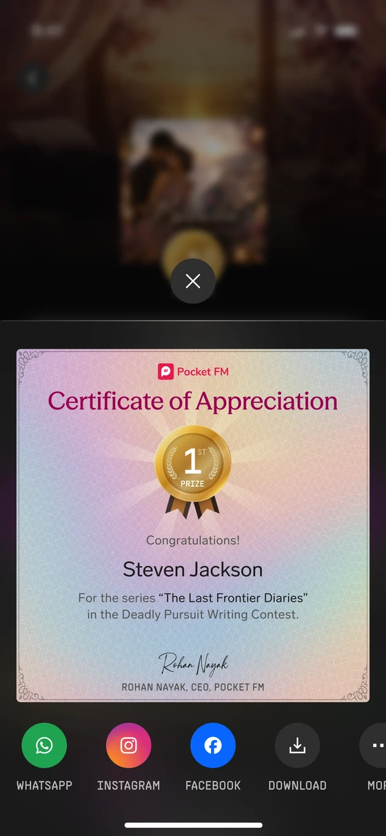
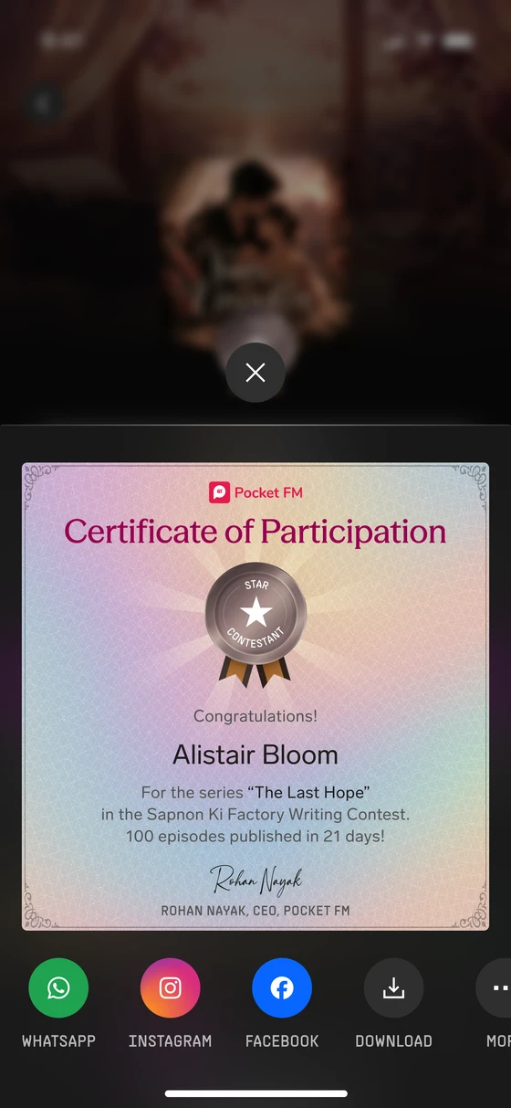
Why post-contest experience matters
Writers who submitted a valid series got no acknowledgment of what they'd built. Winners got no celebration. Everyone else got no recognition for the effort. Writers who didn't make it got no closure. And writers who hadn't yet participated had no way to see that the prizes were real or that the process was fair.
Key decisions



Closing the contest loop
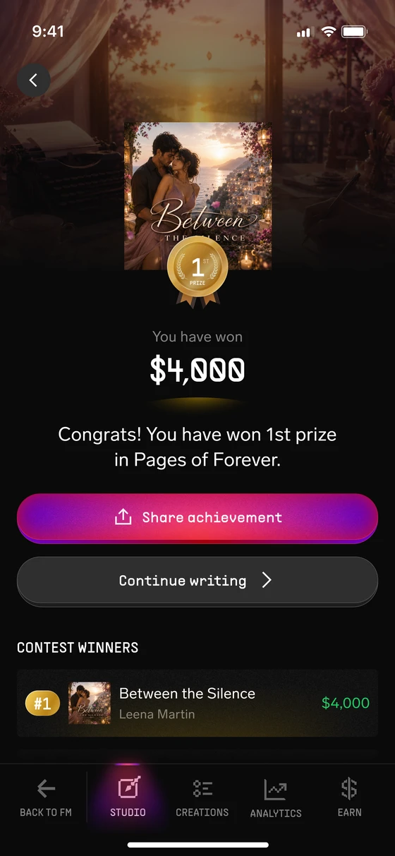
The results experience was designed to celebrate achievements, increase the visibility of winning series, and encourage writers to explore new contests.
- Made celebration the primary focus of the page, highlighting the winning series, prize, and achievement to create a memorable moment worth sharing.
- Showcased winning series to increase their visibility and help writers discover what successful submissions look like.
- Created a re-engagement path by surfacing live contests directly on the results page, so writers could move straight into their next contest.
100%
Winners shared their achievement
The results experience celebrated winners, increased the visibility of winning series, and encouraged writers to stay involved in future contests.
- • 100% of winners shared their achievement certificate.
- • 95% of visitors reached the Explore Live Contests section, with 25% exploring at least one new contest.
- • ~45% of visitors clicked into a winning series to understand what successful submissions looked like.